

The challenge
A charity website has to serve audiences that want completely different things. A donor is deciding whether to give. A researcher is checking whether they qualify for a grant. A journalist is looking for the history. A board member wants the annual report.
The Foundation had all of that material. Finding any particular piece of it was the problem, and a hundred years of history is only an asset if a first-time visitor can grasp it in a few seconds.
The centenary raised the stakes. A milestone year draws attention from people who have never heard of the organisation, and the site had to convert that attention rather than lose it.
What we built
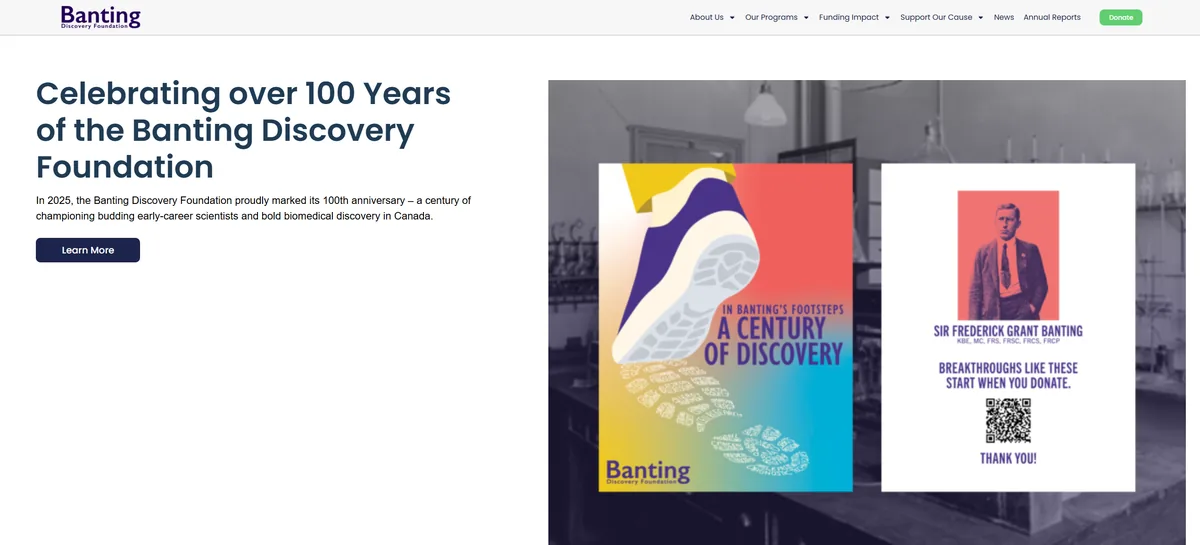
A restructured site that leads with the centenary, separates the audiences, and puts the donation path within reach from anywhere.
Audience-led navigation
Distinct routes for donors, grant applicants and people researching the Foundation's history and impact.
Credibility first
The hundred-year record placed where a first-time visitor sees it immediately, rather than buried in an about page.
Clear giving path
Donation reachable from every page without turning the site into a fundraising appeal.
Built to be maintained
Programme pages, news and annual reports structured so the team can update them without a developer.
Why this one is different
This was a build rather than an ongoing engagement, so there is no search performance data to report. It would be easy to invent some. We would rather say plainly that the brief was clarity and credibility, both of which are judged by the people who use the site rather than by a ranking report.
It is included here because it shows the range. A charity marking its centenary needs something different from a law firm chasing commercial search terms, and both should still feel like they were built with care.
If you want a case study with numbers attached, the Mungar and James Deep Law projects both have them.
Working on something similar?
Send us your URL and we will send back a plain-English audit of what is working, what is not, and what it would take to fix. No charge, no pitch deck.